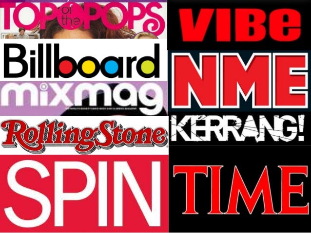
This is a mood board of the mastheads of some of the most popular music magazines currently in circulation.
Most of these mastheads are in bold and sans serif suggesting that they are bold, lack elegance (a serif indicates elegance and maturity) and is intended for younger audiences. Most of the magazines have a particular trait in the masthead that is recognizable, like NME being red, Top of the Pops having, for lack of a better term, a swirl at the end or the b, o, a and d being colored in. The Kerrang magazine's masthead is unique compared to the others; the title is memorable because of it's onomatopoeia and the lines going through the letters as if the masthead was broken.

No comments:
Post a Comment